

Writing effective link text
When I was younger I used to love reading choose-your-own adventure books. Instead of reading the book from start to finish I could make the decisions for the main character and ultimately decide the outcome of the book. The Internet is essentially the same, except it's the largest choose-your-own-adventure book ever with literally billions of pages to choose from.
Why is link text so important?
Because of this unique ‘choose-your-own adventure’ way the Internet is structured, it's essential that we can find and understand links quickly. Most pages we visit on the web don't contain the information we're looking for, but merely help us find the page we want. Think about the process you go through to find information on the web:
- You go to a website
- You scan the page looking for a link that might take you where you want to go
- You follow the link and scan this new page looking for the information you're after
- If you can't find what you want you scan through the links on this page and click on one
- And so on until you find what you're looking for (or until you give up!)
I can recall situations where I've spent up to 20 or 30 minutes just searching for something on the Internet, every few seconds clicking on links that I was desperately hoping would take me to the information I was looking for. If I could have easily found those links and quickly understood their destination maybe I wouldn't have had to search for so long.
So, we've established that it's important for link text to be easy to find and understand. So what can you do to achieve this goal? Simple. Follow these six guidelines for how to write effective link text and your site visitors will be able to find what they're looking for quickly and efficiently.
1. Contrast link text colour and regular text colour
In order to be able to easily spot them, links should be a different colour to the rest of the text on the page. Sounds pretty obvious but it's truly amazing how many websites don't do this. This is most common in corporate websites who decide to have black text and black link text.
By far the most common colour combination is black text with blue link text, but it's certainly not necessary to follow this. To avoid confusion though, it is probably best to avoid making regular text blue and/or link text black.
Some usability experts insist that link text has to be blue as blue is the most common link colour on the web. They argue that Internet users become accustomed to certain conventions and every website should follow these conventions or fear confusing their visitors. However, there are enough websites with non-blue link text for this to not be labeled as a convention so it could be argued their reasoning isn't sound.
2. Underline link text
When we scan down pages any horizontal line cuts right through our vertical line of scanning. The underline below link text is an example of this so it's really advisable to include those underlines with link text. Additionally, underlining link text can be beneficial to the one in 20 colour blind people and users with poor vision. One quick tip: Never, ever, under any circumstances, underline non-link text.
It's not always necessary to underline links in navigation menus because they only contain links. When we look at navigation menus we therefore don't have to make the distinction between link and non-link text.
3. Ensure link text is descriptive of its destination
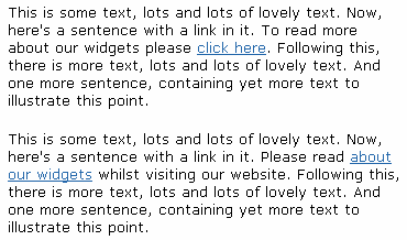
We scan web pages looking for the information that we're after. Have a quick look at the following two paragraphs:

The first thing that stands out in the first paragraph is ‘click here’. By itself, ‘click here’ is completely meaningless and its use should be avoided like the plague. The second paragraph is far superior as when you scan it you can instantly work out the link destination. You can then decide whether to click it or not without having to read any of the surrounding text.
4. Make visited links change colour
By changing the colour of visited links users are provided with a visual clue as to where they've already been on your website. This is essential if you want to allow visitors to freely explore your site without continually going back to where they've already been - a frustrating experience and one that's sure to encourage them to go elsewhere.
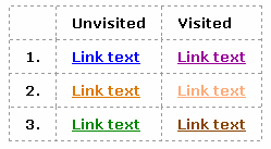
It's also important to choose effective colours for unvisited and visited links. Look at these three examples:

The first one is the best as it's the browser default value and people are most accustomed to it.
The second one is fine too. If you don't use the default blue/purple colour scheme then make the visited link text appear less bright and saturated so that unvisited link text stands out above it - this has become quite common on the web so is perfectly acceptable.
The third example is not effective at all. Although the two colours are different, after visiting a few pages users may get confused as to which are the visited and which the unvisited links.
One other thing to be aware of: to prevent confusion, wherever possible avoid using purple for unvisited links and/or blue for visited links.
5. Limit link text to a maximum of four words
When web pages appear we scan them, looking for the link that will take us to the information we're after. When we scan we only spend a split-second looking at the text contained in any link, so it's really difficult to quickly take in the content if there are more than five words in the link text.
Usually it's really easy to reduce the number of words within the link. For example, we can change:
Find out more about next week's conference
to
Find out more about next week's conference
If you really can't convey the meaning of a link in less than four words, be ruthless! Include the most important words and remove the other words from the link, keeping them in the same place in the sentence. When users scan the screen they'll be able to understand the basic meaning of the link and can then read the words around it. They can then out if the link really will take them to the destination they want to go to.
6. Place important words at the front of link text
When scanning web pages for the link we're after, the first words we see are the words at the front of the link text. We may not even see any of the words after the opening two words. So, to improve the above example even more, we can change:
Find out more about next week's conference
to
Find out more about the conference next week
The word conveying the most useful information to the reader, ‘conference’, is at the front of the link text and is now the most likely to be seen by our site visitors scanning the page.
Conclusion
Link text is really important. They're what make the Internet what it is. Links allow us to choose our own adventure on the Internet. Follow these guidelines and your links will be easy to find and understand quickly, for which your site visitors will surely thank you.
This article was written by Trenton Moss, founder of Webcredible. He's extremely good at web accessibility training and knows an awful lot about the Disability Discrimination Act.