


Innovative user interface design
Increasing numbers of websites are developing new types of user interface design, taking advantage of users' increasing levels of Internet-sophistication and faster connections. These new interfaces often allow users to view and manipulate large quantities of data.
This article will have a look at some of the more interesting user interface design ideas we've come across recently:
- Slider-based filtering
- Fisheye menus
- Treemaps
- Drag-and-drop
The point of this article is not to promote any of these user interface designs, but rather to offer them for the purposes of interest and inspiration. Although we have yet to run any large-scale usability testing on them, we consider each to have the potential (if used in the appropriate circumstances) to offer interesting possibilities for supporting users in the performance of their tasks.
Slider-based filtering
The user interface design of Amazon's Diamond Search uses click-and-drag sliders to allow users to broaden and narrow a wide range of filtering criteria. The page then automatically updates to show how many results conform to the users' selected criteria.
This can be used to create an intuitive and informative interface, making it easy for users to search through a large data set:
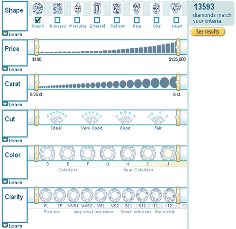
The number of results is displayed on the right hand side of the page. This means that users only need to submit their search when they're happy that the number of search results is sufficiently small.
Users can narrow their search criteria by using the sliders, thereby reducing the number of results that will be displayed:
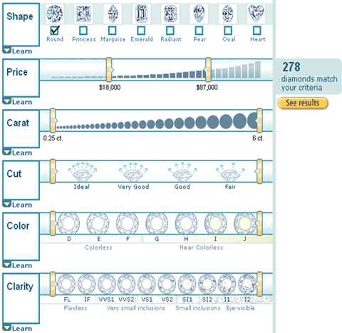
When users are happy with the search criteria, they simply select the 'See results' button. The great thing about this design is that users will know if there'll be no search results, without having to actually run the search.
Fisheye menus
Fisheye menus can be very useful in helping users to navigate and select items from a long, ordered list. These menus dynamically change the size of menu items to provide a magnified-focus area around the cursor. This makes it possible to present the entire menu on a single screen without requiring buttons, scrollbars, or hierarchies.
Fisheye menus could potentially be a great way of having users easily navigate through a long lists.
Treemaps
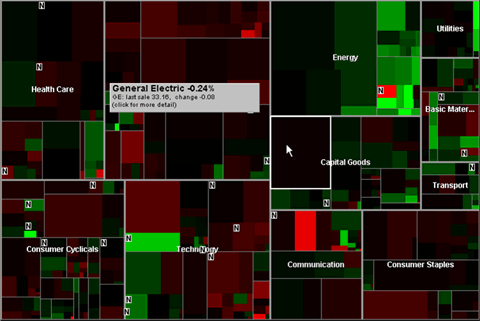
Treemaps display rows of data as groups of squares that can be arranged, sized and coloured to graphically reveal underlying data patterns. This user interface design can be used to present complicated data relationships (such as hierarchical relationships).
An example can be found on the Smartmoney website, where a tool allows visitors to view information on hundreds of stocks at a glance. In the example below, stocks are grouped according to sector and represented in differently-sized rectangles according to their market capitalisation. Colours are used to indicate significant positive (green) and negative (red) price movements.
Further details on a company are available by mousing over their rectangle (e.g. General Electric in the example below).
Drag-and-drop
This type of user interface designs makes use of users' familiarity with moving elements around (users may have experience of doing this within Microsoft Windows applications, for example). Panic Room's online store allows users to either click a 'button/plus symbol' to add an item to their cart or drag-and-drop the item into it.
To do this is relatively simple. You simply click on the product you want to drag into the basket: 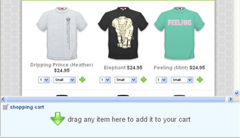
Whilst holding down the mouse button, drag the item across the screen and into the basket: 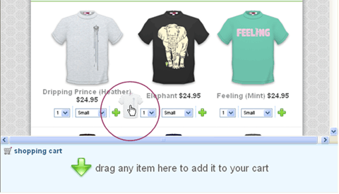
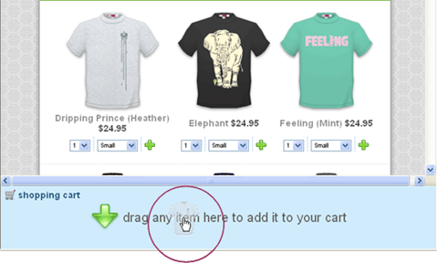
Finally, release the mouse button to drop the item into the basket: 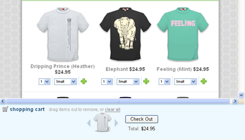
Conclusion
Innovative user interface design is key to developing new and improved user interaction online. The problem with designing a totally unique user interface however is that users may be unable to quickly and easily learn how to interact with it.
If you do develop a totally innovative user interface design, do be sure to carry out usability testing before launching. This way you can check if users can grasp what they need to do and what you need to do to make the interface more intuitive.
Do of course make an effort to visit the site we've mentioned above, as interfaces are made to be interacted with!
This article was written by Tim Fidgeon, a usability consultant at usability and accessibility consultancy, Webcredible. He knows an awful lot about user interface design and intranet usability.
09 dec 2003 - 730