


Planning a usable website: A three-step guide
A website is like an information flow, with you as the provider and your site visitors as the receivers of the information. If you don't plan your website with this in mind right from the start, you could find yourself with a brand new website that solves all your immediate needs... but not those of your site visitors.
Clicking away from your website has never been easier for Internet users. There are about 35 million websites competing with yours on the Internet (source: Zooknic). Search engine results are becoming better and better and Internet connection speeds faster and faster - finding one of your competitors' websites is now very quick and very easy.
1. Work out your site visitors' immediate needs
Your website has to provide information that fulfils the immediate needs of your site visitors. This is the fundamental principle behind usable website design, so let's repeat it one more time: Your website has to provide information that fulfils the immediate needs of your site visitors.
OK, now we've got that straight, we come up against a problem: Your goals for the website are probably different to the immediate needs of your site visitors. Oh dear.
Let's illustrate this problem, and its solution, with the example of a web design company's website. Their immediate goal is to get visitors to contact them and ultimately commission them to do some web development work. Their site visitors are probably interested in getting web development work done (if not, why are they on this website?), but it's unlikely that this is their immediate need when they arrive at the website.
The immediate needs of the site visitors' are probably to answer questions like:
- Can I trust them?
- Are they any good at what they do?
- Will they get the job done?
Before the website begins to sell to its site visitors, it has to answer their questions and put their fears to rest. This is fundamentally important, so one more time: Before the website begins to sell to its site visitors, it has to answer their questions and put their fears to rest.
In the case of this web design company, they could provide a portfolio, client testimonials etc. Can you think of any other information they should offer?
2. Create an information flow
Now we've worked out what our site visitors' immediate needs are, we need to create an information flow, a path (or paths) that your site visitors will traverse whilst on your website. The path(s) will initially address their concerns and needs and will gradually take them towards completing your goal for them. To create this plan we'll need to:
- Identify the different groups of people who'll use your website
- Work out what you want each of these groups to achieve on your website
- Identify the information you'll need to provide for them to achieve this (and in what order)
- Work out what might put them off achieving this
- Identify the information you'll need to provide to prevent them being put off
From this, you'll be able to create a list of website pages and a rough idea of how they might flow together. You'll then be able to work out exactly what pages to include on the website and how to group these pages together.
Bear in mind though, some users will need more information than others, so you'll always need to provide them with a choice of continuing on the information flow or jumping off so that they can achieve the goal you've set for them.
Going back to the website of the web design company, an information flow that their site visitors might go on could look something like this:
- Homepage
- Portfolio
- Client testimonials
- Company background
- Staff bios
- Terms & conditions
- Good web design tips
- Contact us
The web design company's ultimate goal is for site visitors to contact them and request their services. Wherever users are in this flow, they must be able to easily and immediately jump straight to the contact page at any point.
You've probably already seen this in action on websites. You arrive at the homepage and there are two or three prominent links (often in the form of boxes) telling you some basic information and requesting that you click on them to take you into some other part of the website. You go to that page on the website, read the information and then choose where to go next. And this keeps going on, until you either quit or complete the desired goal of the website.
So, the web design company's homepage might look something like this:
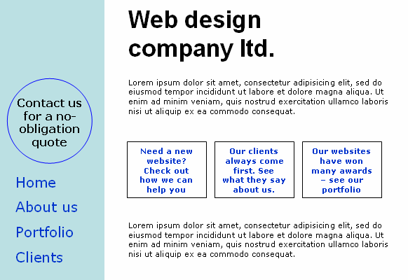
The three boxes in the middle answer some immediate questions that users may have and proactively address their concerns. The contact us button on the top-left can remain in that position on every page, so users always have the opportunity to jump to the contact page.
3. Usability testing
Once the website plan has been created, it's time to test it. This is the most important usability test that needs to be done and the one that will save you the most time and money in the long run. According to IBM, every £1 invested in making your website easy-to-use returns £10 to £100.
If you don't do any usability testing you may discover that the structure of the website doesn't make sense once the website's up and running. This can and has happened and it leaves you with two choices: redesign the website or make a new website - neither are attractive options.
The most common objections to doing usability testing are:
- It's too expensive!
- It'll take too much time!
- I don't know how to do it!
Wrong, wrong, and wrong! Usability testing, especially at this early stage, is incredibly cheap, quick, informal and easy to do. You just need to show five people the plan/site map of the website and ask them:
- What's the point of this website?
- If you were on this homepage, where you would click? And where after that?
- Is it what you need?
That's it! As long as these five people roughly fit into your user profile everything should be fine. It's been shown that using five people for a usability test will uncover 85% of the usability issues of the website.
This article was written by Trenton Moss, founder of Webcredible. He's extremely good at web accessibility training and knows an awful lot about the Disability Discrimination Act.